Roadmap MBA Web Accessibility Audit Scope
- In December 2022 and January 2023, the team at Consult Seated (Link: https://consultseated.com/ – opens in a new tab) conducted a full Web Accessibility Audit on Roadmap MBA.
- The testing was completed by Kat Paylor-Bent, Nathan Bent and third party testers.
- Consult Seated audited 54 pages of the site, which contains circa 248 pages, this will mean 22% of the site was audited.
- The pages selected have been done to maximise the value back to the client, it will give a clear understanding as to how a disabled individual will perceive the site and what common issues have been identified that can then be applied to the rest of the site, as required by the client.
Roadmap MBA pages selected for Web Accessibility Audit
- The following pages are in scope: Home, The Course, Blog, Contact, FAQ,Pricing, Login, Privacy Policy, T&Cs-to test usability and navigation around the site and ensure good first impression for disabled users.
- Getting started module – test initial user experience to ensure course users not impacted before fully using the course.
- Module 5 – to test use of videos as part of the course.
- Module 15 – to test inset diagrams and detailed instructions.
Roadmap MBA Web Accessibility Audit Method
Tab Test –
- can the links in the page be navigated via the Tab key and selected using the Enter key
- Off screen test –Is any content being navigated out of view from the page being navigated via the Tab Test
Screen Reader Test
- Are links explained, is there Alt text and is it useful and descriptive , Custom controls such as buttons have their use explained and can be controlled via keyboard , If a pop out is selected such as a video, is focus directed to it
- Page structure –can the page navigated using appropriate page headings and using heading tags
- Are main, and nav tags used
- Can the site be navigated using the using landmarks menu , banner navigation and main menu and hyperlinks menu, using screen reader
- Colour and contrast meets minimum contrast ratio of a contrast ratio of at least 4.5:1 for normal text and 3:1 for large text.
Roadmap MBA Web Accessibility Audit Findings
- Banner and Main Navigation at the top of each page can be navigated using the Landmarks Menu in the Screen Reader
- Site Pages can be navigated and read using the Landmarks Menu in the Screen Reader
- All links on each page can be selected using the Hyperlink Menu in the Screen Reader
Findings
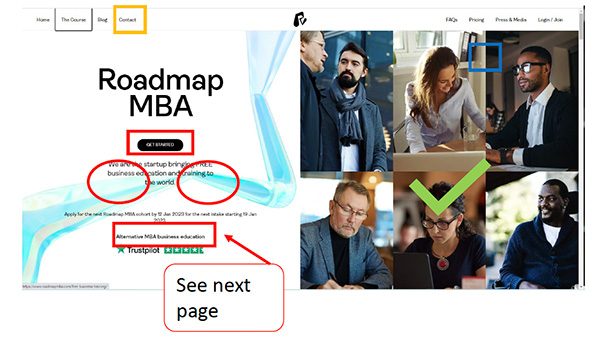
- The following part of the home page passed the tab test as all links could be selected
- The images are a great example of alt text and are well written
- but the links when selected, were hard to discern as it has a thin border and the background is the same colour as the selection
- Our accessibility tester who has limited sight, struggled to distinguish the focus highlight, and additionally could not distinguish the black get started button
- In parts circled in red, the blue of the background logo, drops the contrast difference, making it difficult to be read by our tester
Recommendations
- Use High Contrast to identify an area has been focused on (example in orange and blue)
- Change button colour or highlight in high contrast
- Adjust Logo to not overlap with text
The full Roadmap MBA Web Accessibility Report
You can download and view the full 25 page Roadmap MBA Web Accessibility Report here – link opens in a new window. https://www.roadmapmba.com/wp-content/uploads/2023/01/roadmapmba.com-Final-Report-12.01.2023-small.pdf
Roadmap MBA Web Accessibility Improvements
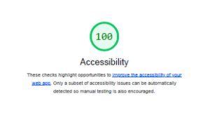
Although the Roadmap MBA scored highly on the test, we have a range of improvements planned for Q1 2023.
We are on a continuous mission to make business education accessible.
Thank you for your continued guidance and support.